CASE STUDY: VANITEC
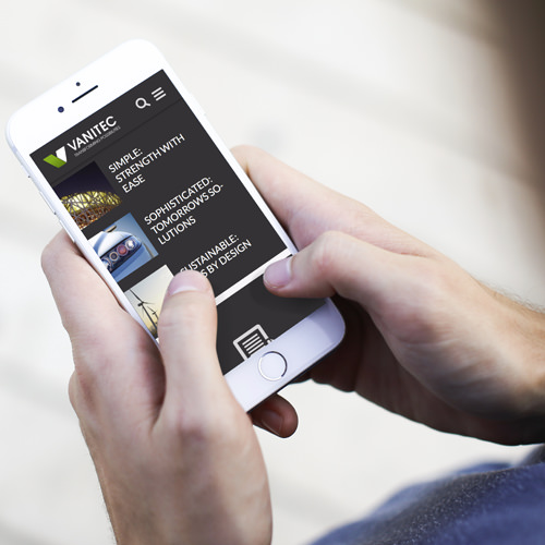
Vanitec approached us to redesign their logo, identity and create a website for them to replace their old website. Vanitec had a very clear idea on the goals they wanted to achieve with their new website, and played a big part in the final solution of the website.
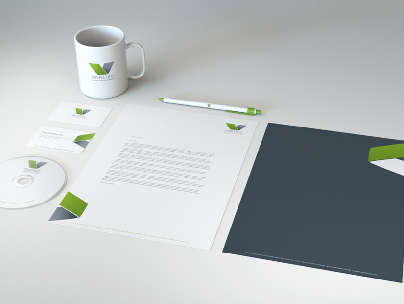
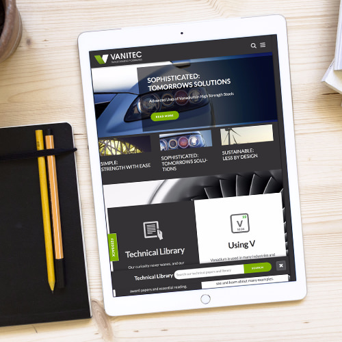
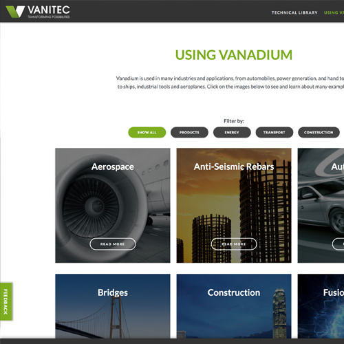
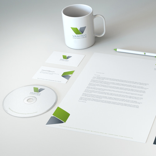
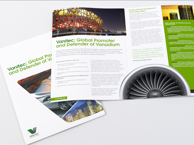
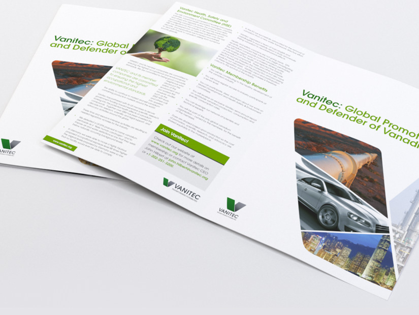
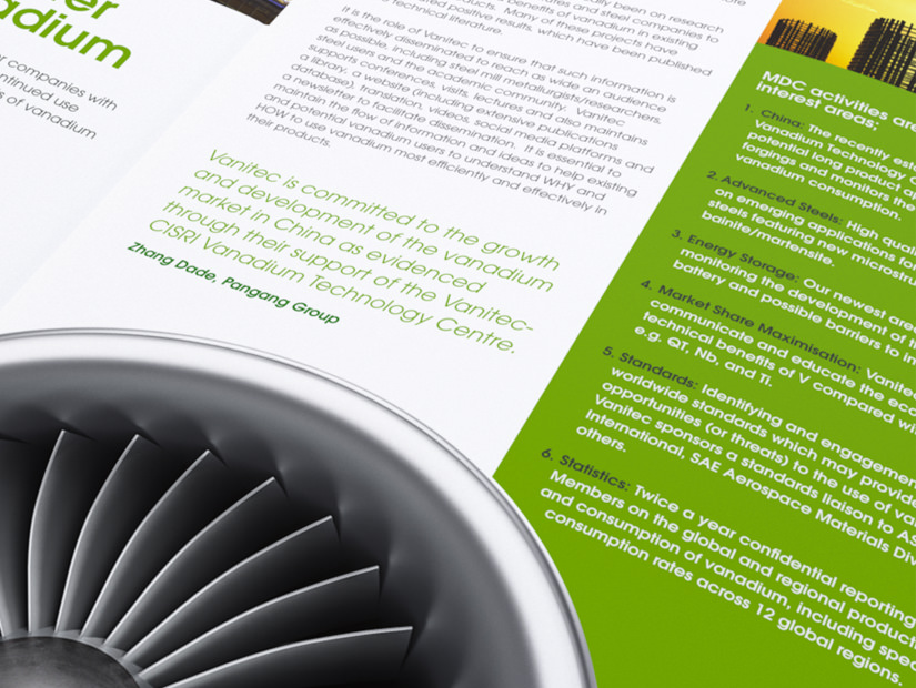
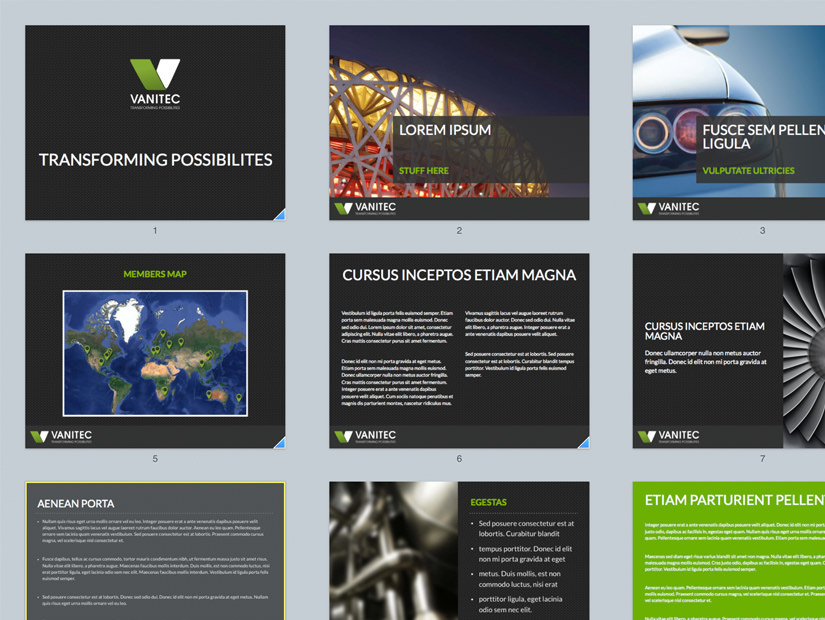
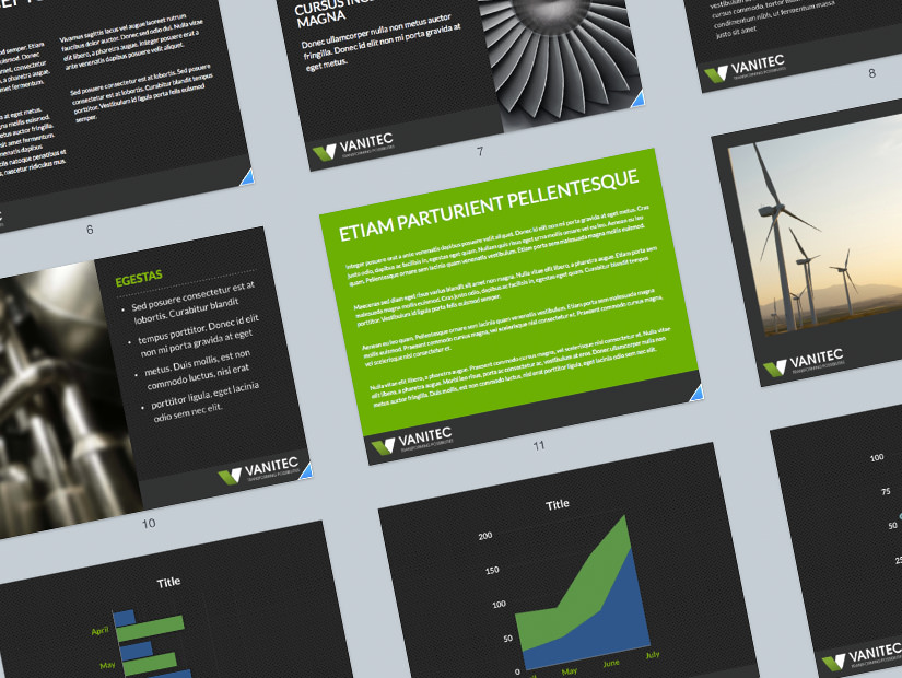
Octosaurus created a logo, look and feel, stationery, a fully content managed, responsive website, 4 sided A4 brochure and keynote presentations
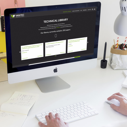
For the website, we went through a thorough process of research to work out the best possible user experience for Vanitecs users. The main focus was on the Vanitecs comprensive library of technical papers, and how best for users to find and search the library.
VISIT VANITEC'S WEBSITELogo & Identity
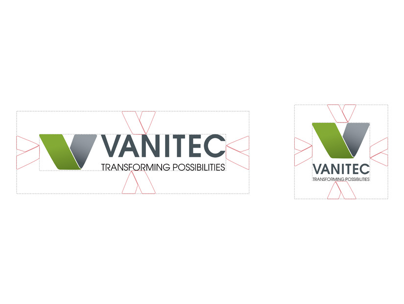
Vanitec wanted a simple strong mark incorporating their strapline, that could be used across all Vanitec's material. It needed to work in colour and in black and white. Also to be able to use the Logo with the 'V' on the side, or with the 'V' above the strapline, so two versions were created.
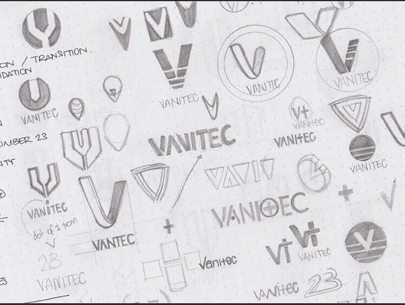
We went through two rounds of ideation and the result was a strong 'V' mark, that was inspired by the shape/form of machine bending steel. The new color of the mark was representative of the health, safety and environmental elements, that are a very important part of the Vanitec organisations image.
